Colour Theory for Painting: A Matter of Pigments' Interaction
- Laura Longoni

- May 7, 2023
- 4 min read
Updated: Nov 28, 2025
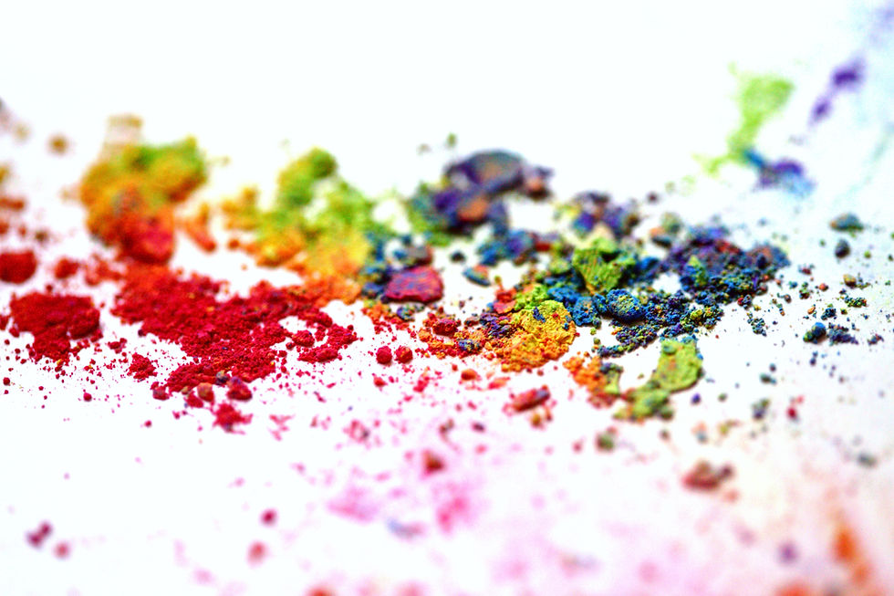
How many times did you mix your primary colours in the hope to get the imagined brilliant orange or the perfect purple but instead you get only muddy colours?
Since school time we are taught that the primary colours are red, yellow, blue and that from mixing these colours we can obtain all other colours. But the more I used only this three colours, the more I disappointed and became aware that this was a very limited palette and that it didn’t give me the expected results. For example taken the colour Purple (blue + red), it didn’t matter what red or blue I used. I have never managed to create a beautiful purple but only a muddy tone.
Then I did some research to explore the way colours work and here is what I discovered.
Primary colours from secondary colours: an experiment for the colour theory for painting.
What would you think if I told you that primary colours can be recreated from mixing secondary colours?
Instinctively you would say that it is impossible, as we have learned in school that primary colours are solid and cannot be recreated.
However, I have found that the standard rules of colour theory are not enough in the case of acrylics (or pigment-based paints) to understand the mixing behaviour of colours. One should also consider pigment interaction.
I realised this when I came across a YouTube video of artist Cesar Cordova explaining that we can recreate any primary colour from its secondary colours. At first I thought, "How is that possible? All my life I had been convinced that primary colours could not be recreated by mixing other colours. Was I wrong?
In his tutorial he explained that when you mix secondary colours you have to analyse the individual components.
Let's take the colour yellow as an example.
We all know that the secondary colours of yellow are orange (yellow+red) and green (yellow+blue). Similarly, we know that if you mix all 3 primary colours, you get the colour white because the primary colours neutralise each other.
So when orange and green are mixed, the following happens:
The blue component of green acts as a complement to orange and is neutralised;
The red component of orange acts as a complement to green and is neutralised;
We are left with the yellow component, which allows us to have a primary colour.
We can proceed in the same way for blue or red.
In case of red, we can use orange and violet and check the following:
The blue component of violet behaves like a complement of orange and is neutralised;
The yellow component of orange behaves like a complement of violet and is neutralised;
The red component is thus retained and gives us the possibility of restoring a primary colour.
In case of blue, it is possible to use green and violet and check the following:
The red component of violet acts as a complement to green and is neutralised;
The yellow component of green acts as a complement of violet and is neutralised;
The blue component is thus preserved and gives us the possibility of restoring a primary colour.
The Artist's Colour Wheel and its application
As Cesar Cordova explained, the starting point for this new way of looking at things is another colour wheel, Bruce MacEvoy's "Artist's Colour Wheel".
This type of colour wheel was developed to better understand the behaviour of watercolours and offers a different approach to learning how to mix colours.
The starting point is the pigments in the acrylic paint we want to use and their position on the colour wheel. After defining them, we draw a line between them on the colour wheel and see what kind of colour we get when we mix them:
If the line goes through the middle, we get a grey/opaque colour because the pigments are complementary to each other.
If the connecting line between the pigments does not go through the middle, we get a final colour in one of the shades the line goes through.
If more than two pigments are mixed (as in our experiment to make the yellow below), the final colour will be within the space created by the connecting lines between the pigments, and depending on the amount of each pigment in the mixture, the colour will tend towards the pigment with the greater amount.

To test the accuracy of this process, I used the following colours:
Violet (Arteza - contained pigment PV23).
Permanent blue-violet (Amsterdam Royal Talens - contained pigments PV23/PV19)
Cadmium Orange shade (Liquitex Basic - contained pigment PO73)
Vermilion (Amsterdam Royal Talens - contained pigments PO34/PY74)
Bright yellow-green (Liquitex Basic - contained pigments PW6/PY3/PY74/PG7)
Greenish yellow (Amsterdam Royal Talens - contained pigments PY74/PG7)
Bright green (Amsterdam Royal Talens - contained pigments PG7/PY74)
Phthalo green (Amsterdam Royal Talens - contained pigment PG7)
As you can see, the results obtained are as follows:
For blue, as indicated in the artist's colour wheel, mixing PG7 pigment and PV23 pigment or PV23/PV19 pigments gives a dark blue with a violet note similar to indigo;
For red, as indicated in the artist's colour wheel, a violet red is obtained by mixing PO73 pigment and PV23 pigment or PV23/PV19 pigments.
For yellow, as indicated in the artist's colour wheel, by mixing PO73 pigment and PY74/PG7 pigments, I obtained a colour ranging from ochre yellow to golden yellow, depending on the amount of yellow pigment contained in the original colour


Conclusions
In summary, we need to consider more than just classical colour theory when it comes to painting with pigment-based colours.
As shown, pigments behave somewhat differently than standard rules from RYB or CMY(K) colour systems and, even if it is not possible to reproduce the primary colours in their pure form (red, yellow, blue) with this method, we can obtain tones from the secondary colours that come very close to the primary colours.
In any case, in the case of the acrylic pouring technique, this wheel allows us to better select our colours based on the pigments they contain, possibly avoiding the formation of neutral or muddy colours that would detract from the brilliance of our artwork.
I hope I have helped and inspired you to experiment and find new colours. Let me know in the comments.
Thank you for reading. If you like the post, feel free to leave a like, a comment and don’t forget to follow my blog, my Instagram and share the content on your social media.
Have a colourful and creative day!
Laura


Comments